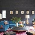
Flat walls are fine. They are polite. They mind their own business. But sometimes a room needs more than “polite.” It needs movement, shadow, texture, personality, and maybe a little drama that does not require buying a velvet sofa named Beatrice. That is where creative paint techniques come in.
Paint is one of the most affordable ways to transform a home, but the real magic happens when you stop thinking of it as a simple color change and start treating it like a design tool. With the right technique, a blank wall can look taller, softer, richer, older, fresher, or more architectural. You can create the look of wallpaper, plaster, fabric, tile, or a custom mural using little more than paint, tape, brushes, rags, sponges, and a healthy willingness to say, “Well, that wall was boring anyway.”
This guide explores seven creative paint techniques to add dimension to your home decor, from subtle limewash-style finishes to bold geometric accent walls. Each idea includes practical tips, where it works best, and how to avoid the classic DIY tragedy known as “I removed the tape and now I have emotional damage.”
Why Dimensional Paint Techniques Work So Well
Dimension in decorating is all about layers. A room feels more complete when the eye has different surfaces, tones, textures, and focal points to explore. That does not mean every wall needs to shout. Sometimes the most dimensional effect is whisper-soft: a cloudy color wash behind a bed, a tone-on-tone stripe in a hallway, or a limewash finish that changes gently as daylight moves across it.
Creative wall painting techniques work because they influence how light interacts with a surface. Matte finishes absorb light and feel calm. Satin and semi-gloss finishes bounce light and can make trim or architectural details stand out. Layered colors create depth. Pattern adds rhythm. Texture gives a wall the visual weight of something more expensive than a can of paint and a Saturday afternoon.
Before choosing a technique, look at your room’s natural light, furniture style, ceiling height, and existing architectural features. A small powder room can handle a moody stencil. A large living room might love a subtle color wash. A kids’ bedroom can survive playful stripes. A narrow hallway may benefit from vertical lines that make it feel taller and less like a stylish tunnel.
1. Color Washing for Soft, Cloudy Depth
Color washing is one of the most timeless decorative paint techniques because it creates a layered, slightly translucent finish. Instead of a solid block of color, the wall has movement, almost like watercolor on plaster. It feels relaxed, romantic, and imperfect in the best possible way.
How it adds dimension
Color washing creates depth by allowing subtle variations in tone to show through. The result can make a wall look aged, sun-washed, or softly textured. It is especially beautiful in bedrooms, dining rooms, entryways, and living rooms where you want atmosphere rather than loud pattern.
How to try it
Start with a clean, smooth base coat and let it dry completely. Mix your top color with glaze according to the product instructions, then apply it in loose, overlapping strokes with a brush or cloth. Work in small sections so the glaze does not dry before you blend it. Use a clean rag to soften edges and remove excess color.
The trick is to avoid perfection. If your strokes are too even, the finish can look stiff. Let the color move. Let it breathe. Think “Tuscan villa,” not “spreadsheet made of paint.”
Best color ideas
Try warm beige over cream for a cozy neutral wall, smoky blue over pale gray for a restful bedroom, or terracotta over peachy beige for a Mediterranean-inspired dining space. For a modern look, use two shades from the same color family so the effect feels layered rather than busy.
2. Sponging for Organic Texture
Sponging has had a few identity crises over the years. In the wrong hands, it can look like a 1990s basement rec room that owns too many lava lamps. But when done with restraint, modern sponge painting can create a sophisticated, organic texture that feels earthy and handcrafted.
How it adds dimension
A natural sea sponge creates irregular marks that mimic stone, plaster, or mottled fabric. Because every dab is slightly different, the wall gains depth and movement. This technique is great for spaces that need warmth, such as reading nooks, guest rooms, powder rooms, or accent walls behind open shelving.
How to try it
Paint the wall with a base coat and allow it to dry. Lightly dip a damp sea sponge into your accent paint, blot off the excess, and dab the wall in a random pattern. Rotate your wrist as you work so the same sponge shape does not repeat like a suspicious potato stamp. Step back often to check balance.
For a softer finish, choose colors that are close together, such as ivory and sand, sage and olive, or pale gray and greige. For a bolder look, layer a darker shade over a lighter base. The key is moderation. A little texture says “custom finish.” Too much says “the wall has a rash.”
Designer-style tip
Use sponging only on one feature wall or inside a niche if you are nervous. It can also look beautiful on furniture, fireplace surrounds, or the back panel of a built-in bookcase.
3. Rag Rolling for Elegant Movement
Rag rolling is another classic faux painting technique that can look surprisingly fresh when paired with modern colors. It involves rolling a twisted cloth over wet glaze or paint to create soft, broken texture. The effect can resemble fabric, aged plaster, or gentle marble veining depending on your colors and pressure.
How it adds dimension
Rag rolling works because it removes or applies paint in irregular layers. Those broken lines create visual movement across the wall, making the surface feel richer than a flat coat. It is less blotchy than sponging and often feels more refined.
How to try it
Apply a base coat first. Once dry, roll or brush on a glaze mixture in a manageable section. Take a clean lint-free rag, twist it into a loose cylinder, and roll it over the wet surface using light pressure. Keep changing the rag’s position so the pattern does not become repetitive.
You can also use the “rag-on” method, where you dip the rag into glaze and roll the color onto the wall. The “rag-off” method, where you remove glaze from the wall, usually gives a softer and more forgiving finish.
Where it works best
Rag rolling is lovely in formal dining rooms, traditional bedrooms, vintage-inspired bathrooms, and hallways that need character. Pair it with classic trim, warm lighting, and simple furniture so the wall can be the star without auditioning for Broadway.
4. Ombre Walls for a Dramatic Gradient
An ombre wall fades from one shade to another, usually moving from dark at the bottom to light at the top. This technique adds instant dimension because the wall appears to shift with height and light. It can feel dreamy, modern, playful, or dramatic depending on your palette.
How it adds dimension
Ombre creates the illusion of depth through gradual color transition. A darker base can ground the room, while a lighter top can make the ceiling feel more open. It is especially effective behind a bed, sofa, desk, or reading corner.
How to try it
Choose three shades: light, medium, and dark. Paint the entire wall with the lightest color first and let it dry. Then paint the darkest shade near the bottom and the medium shade through the center, leaving blending areas between each section. While the paint is still workable, use a brush or damp sponge to blend the transitions with vertical strokes.
Do not panic during the blending stage. Ombre walls often look questionable halfway through, much like bangs after the first snip. Keep blending, feathering, and stepping back. The final effect should feel gradual, not striped.
Best color ideas
Try navy fading into misty blue, forest green fading into sage, clay fading into warm cream, or charcoal fading into pale gray. For kids’ rooms, sunset shades or soft rainbow gradients can be fun without feeling chaotic.
5. Stripes and Tone-on-Tone Lines for Architectural Illusion
Stripes are simple, graphic, and wildly effective. They can make a ceiling feel higher, a room feel wider, or a plain wall feel like it suddenly hired an interior designer. The best part? You only need painter’s tape, a level, patience, and the emotional maturity to measure twice.
How it adds dimension
Horizontal stripes can visually widen a room, while vertical stripes can make walls appear taller. Tone-on-tone stripes create subtle texture without overwhelming the space. High-contrast stripes feel bold and playful, while muted stripes feel tailored and elegant.
How to try it
Paint your base color and let it dry completely. Use a level and measuring tape to mark your stripe layout. Apply painter’s tape carefully along the outside edges of the areas you want to paint. Press the tape firmly to reduce bleeding. For extra-crisp lines, seal the tape edge with the base wall color before applying the stripe color.
Remove the tape while the final coat is still slightly tacky, not fully dry. This helps prevent peeling and leaves cleaner edges.
Creative variations
Try thick horizontal stripes in a playroom, narrow vertical stripes in a powder room, or one oversized horizontal band across a bedroom wall to mimic a headboard. For a sophisticated look, paint stripes in the same color but different sheens, such as matte and satin. The effect appears only when light hits it, which is very chic and just a little sneaky.
6. Stenciling for Wallpaper-Style Pattern
Stenciling is perfect if you love wallpaper but not the price, commitment, or installation anxiety. With a stencil, you can create repeating motifs, borders, tile-like designs, florals, geometrics, or custom patterns. It is also easier to paint over later, which renters and frequent redecorators may appreciate.
How it adds dimension
Pattern gives the eye something to follow. Even when painted in a subtle color, a stencil can make a wall feel layered and designed. Metallic paint can add shimmer, while matte tone-on-tone stenciling creates a soft textile effect.
How to try it
Start with a smooth, clean wall. Secure the stencil with painter’s tape or spray adhesive made for stencils. Use a stencil brush or foam roller with very little paint. Too much paint is the villain here; it can bleed under the stencil and turn your elegant pattern into a decorative blob.
Work slowly, reposition the stencil carefully, and use registration marks if your stencil includes them. Keep a small artist’s brush nearby for touch-ups.
Where to use it
Stenciling is excellent for powder rooms, laundry rooms, entryways, stair risers, cabinet backs, and accent walls behind beds. If you want the look of patterned tile without the renovation bill, a stencil can create a convincing effect on a backsplash area, fireplace surround, or floor when paired with the correct paint and sealer.
7. Limewash and Faux Plaster Finishes for Old-World Texture
Limewash and plaster-inspired finishes have become popular because they bring instant soul to a space. Unlike flat paint, these finishes have tonal movement, softness, and mineral-like texture. They make new walls feel aged in a graceful way, not in a “we found this behind a haunted wardrobe” way.
How it adds dimension
Limewash-style finishes create natural variation as the brushstrokes overlap. The wall reflects light unevenly, giving it depth and softness. It is ideal for homeowners who want texture but do not want heavy pattern.
How to try it
True limewash products usually require specific surface preparation and application methods, so follow the manufacturer’s instructions carefully. Many are applied in thin coats with a wide masonry brush using crisscross or feathered strokes. Faux limewash can also be created with regular paint, glaze, and a brush technique, though the final effect may differ from mineral-based products.
Use limewash in bedrooms, living rooms, fireplaces, dining rooms, and entryways. It pairs beautifully with linen, wood, stone, brass, leather, and other natural materials. Basically, if your decor mood board includes “quiet luxury,” “earthy,” or “Italian vacation I cannot currently afford,” limewash belongs on the list.
How to Choose the Right Paint Technique for Your Room
The best creative paint technique depends on the room’s size, function, light, and personality. A high-energy geometric wall may be perfect in a playroom but exhausting in a bedroom where you are trying to sleep, not solve a visual puzzle. A moody color wash can make a dining room feel intimate but may make a dark hallway feel like a cave unless balanced with lighting.
Use bold techniques where you want a focal point. Use subtle techniques where you want atmosphere. For small rooms, consider one accent wall or a soft all-over finish. For large rooms, you can use paint to define zones, frame furniture, or highlight architectural details.
Also consider your furniture. If your room already has patterned rugs, colorful art, and sculptural lighting, a quieter paint technique may work best. If your furniture is simple and neutral, a dimensional wall can bring the room to life.
Essential Prep Tips Before You Start
Creative paint techniques are more forgiving than flat paint in some ways, but they still need good preparation. Dirt, dust, peeling paint, and uneven patches can ruin the final result. Clean the wall, fill holes, sand rough spots, and remove dust before painting. Use primer when covering dark colors, glossy surfaces, stains, or patched areas.
Always test your technique on poster board or a hidden wall section first. This helps you check color contrast, pressure, texture, and drying time. What looks subtle on a tiny paint chip may look like a thunderstorm on a full wall.
Use quality painter’s tape for stripes, stencils, and geometric designs. Press the edges firmly and remove tape at the right time. Keep small brushes handy for touch-ups. And please, protect the floor. Paint has a mysterious ability to find the only uncovered square inch of hardwood.
Common Mistakes to Avoid
Using too many colors
Dimension does not require chaos. Two or three related colors often look more expensive than five competing shades. When in doubt, use colors from the same family.
Skipping dry time
Layered techniques need patience. If the base coat is not fully dry, tape can pull it up, glaze can muddy it, and your project can quickly become a cautionary tale.
Overworking the finish
Many decorative techniques look best when they remain organic. If you keep blending, dabbing, or rolling forever, the texture can turn flat or messy. Step back often and stop before the wall files a complaint.
Choosing the wrong wall
Pick a wall that naturally deserves attention: behind a bed, sofa, fireplace, console table, dining banquette, or bathtub. A random accent wall can feel disconnected if it does not relate to the room’s layout.
of Real-World Experience: What These Paint Techniques Feel Like in an Actual Home
Creative painting looks simple in a polished tutorial, where the room is spotless, the lighting is perfect, and nobody has misplaced the tape measure under a pile of drop cloths. In real life, the experience is more hands-on, more experimental, and honestly more satisfying. The best part is that most dimensional paint techniques give you room to adjust as you go.
Color washing, for example, feels intimidating for the first ten minutes. The first brushstrokes can look uneven, and your brain may immediately ask why you did not just buy a nice beige. But once the glaze starts overlapping and the wall begins to soften, the effect becomes addictive. The key experience is learning to trust irregularity. The wall should not look machine-made. It should look layered, relaxed, and touched by human hands.
Sponging teaches restraint very quickly. At first, it is tempting to keep adding more marks because the process is fun. Then you step back and realize the wall is beginning to resemble a camouflage jacket. The best approach is to work lightly, pause often, and build slowly. It is much easier to add texture than remove a sponge stamp that looks like a startled mushroom.
Rag rolling feels more elegant than expected. It has a rhythm to it: roll, turn the rag, soften, repeat. It works beautifully when you keep the pressure light. Heavy pressure can create harsh marks, while gentle rolling creates a broken, fabric-like movement. This technique is especially rewarding in evening light, when lamps create shadows across the subtle texture.
Ombre painting is the most dramatic experience because it looks messy before it looks beautiful. Blending colors on a wall requires speed and patience at the same time, which is a rude combination. The best trick is to have all colors ready before starting and to work with a helper if the wall is large. One person can roll the colors while the other blends the transitions. When it works, the room feels custom and artistic, like you hired someone with linen overalls and strong opinions about ceramics.
Stripes and tone-on-tone lines are all about preparation. The painting part is easy; the measuring part is where character is built. A laser level helps, but a regular level, pencil, and patience can still produce great results. The most satisfying moment is peeling the tape and seeing a crisp line. The least satisfying moment is noticing one stripe is slightly crooked after you have already cleaned the brush. Measure carefully.
Stenciling feels slow, but the payoff is huge. It is best treated like a podcast project: put on something entertaining and settle in. Use very little paint, clean the stencil when buildup appears, and avoid rushing corners. The final look can mimic wallpaper so well that guests may ask where you bought it.
Limewash-style finishes are the most forgiving emotionally. They are supposed to look imperfect, so small variations become part of the charm. The experience is calming because the brushstrokes are broad and expressive. In a bedroom or living room, the final wall can make the entire space feel warmer, quieter, and more collected.
The biggest lesson from trying creative paint techniques is that walls are not permanent personality tests. If a technique feels too bold, you can soften it. If a color feels too quiet, you can layer it. Paint is flexible, affordable, and surprisingly forgiving. Start with one wall, test your colors, protect your floors, and remember that every great room needs at least one detail that makes people say, “Wait, how did you do that?”
Conclusion
Creative paint techniques are a powerful way to add dimension to your home decor without a major renovation. Whether you choose soft color washing, organic sponging, elegant rag rolling, dramatic ombre, crisp stripes, wallpaper-style stenciling, or textured limewash, the goal is the same: give your walls depth, movement, and personality.
The best results come from matching the technique to the room. Use subtle texture for calm spaces, bold pattern for energetic areas, and tonal effects when you want sophistication without visual clutter. With careful prep, smart color choices, and a willingness to test before committing, paint can become one of the most creative tools in your decorating toolbox.
Your walls do not have to sit quietly in the background. Let them join the conversation. Just maybe cover the floor first.


